
Book design
Give the page margins room to work
Margins shape how a book is held and read. Test the text block as a spread, allowing for the binding as well as the visible white space.
Book design
Body type has to work across many pages, not only in a specimen sentence. Compare candidates using the actual prose and the characters the book needs.

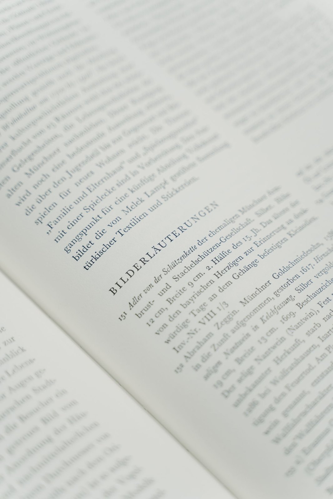
Choose a passage that represents the book’s normal reading. Include punctuation, numerals, italics and any specialist characters the manuscript uses. A handsome alphabet sample cannot show how a typeface handles a page of dialogue or a paragraph full of names and references.
Set the passage in a small number of candidates and print it at the intended page size. Keep the comparison manageable. Changing typeface, size, margins and spacing all at once makes it difficult to understand which decision improved the page.
The same nominal point size can look different in different typefaces. Compare the apparent size and texture of the text, not just the number in the toolbar. A face with a larger lower-case body may feel more prominent at the same setting, which can affect both readability and the density of the page.
Read several paragraphs at an ordinary distance. Notice whether letterforms remain clear, whether lines are easy to follow and whether emphasis is distinguishable without feeling intrusive. The question is sustained reading, not which sample looks most unusual when enlarged.
Inspect easily confused characters where they matter to the content. A technical book may rely on distinctions between similar letters and numerals more often than a novel does. Check the actual notation and words rather than assuming that a typeface suitable for one kind of prose handles every subject equally well.
Try the italic and bold styles you expect to use. Confirm that the family provides the styles and character coverage required by the book. A body face should not leave the designer inventing an inconsistent substitute whenever a note, quotation or language change appears.
Export a sample PDF and inspect it separately from the layout file. Print that export if it is the format intended for production. Check that the type appears as expected and that no substitution has occurred.
Review the font licence for the actual uses and handover you need. Permission to use a font in a design, embed it in a file or transfer font software can involve different terms. Ask the provider or designer when the licence does not answer the question clearly.
Compare the chosen body type with headings, captions and page furniture. The parts should have a deliberate relationship, but they do not need to compete for attention. A restrained body choice can give the writing room while another element carries the book’s more distinctive visual character.
Keep the tested sample and its settings. If a later change is proposed, return to the same passage and conditions. That makes the decision a comparison grounded in the book rather than a new round of guessing from isolated font names.
Book design
Margins shape how a book is held and read. Test the text block as a spread, allowing for the binding as well as the visible white space.
Book design
Type size, line length and line spacing work together. Change them as a system and compare printed samples before settling the reading page.