Book design
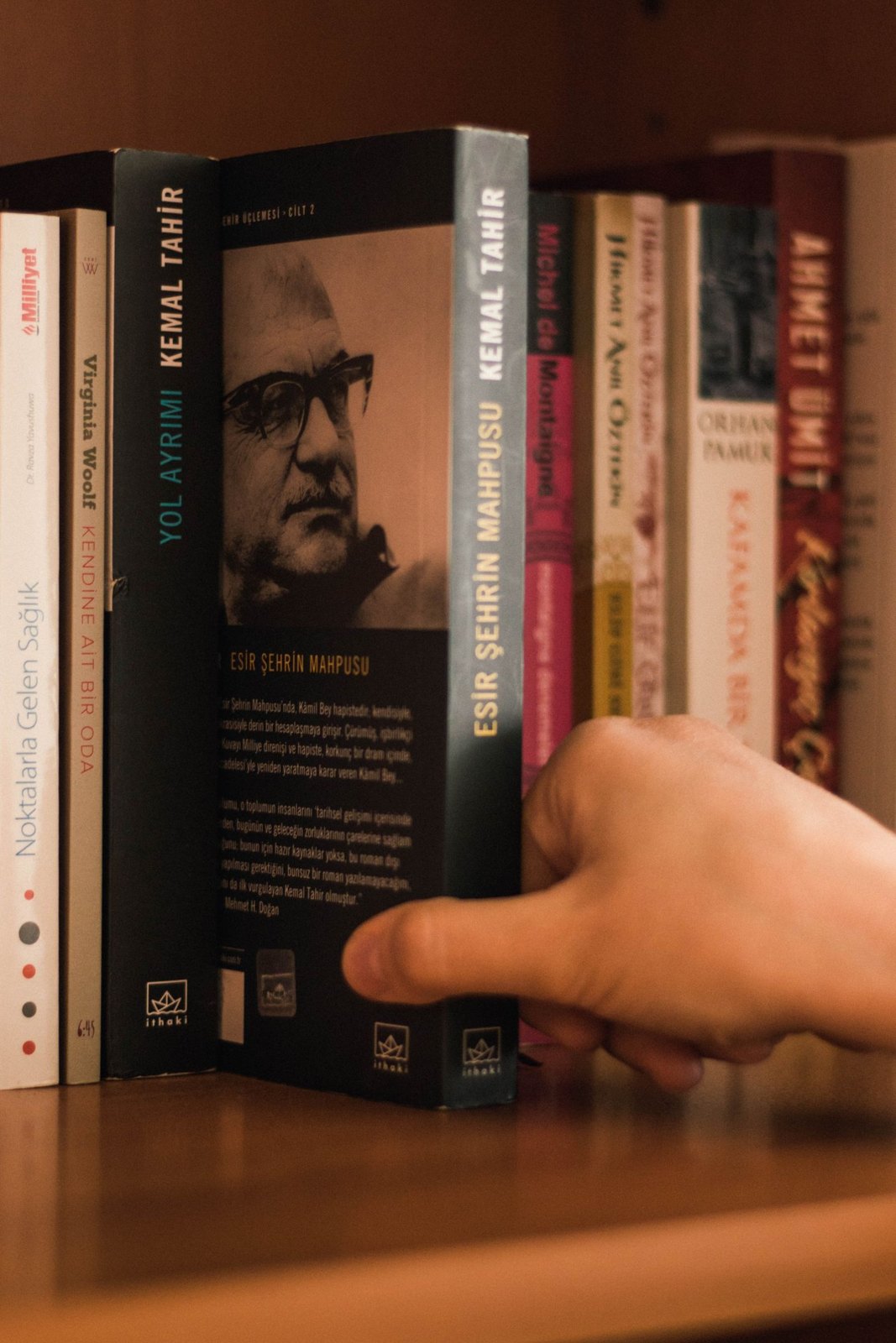
Make room for the back-cover information
The back cover has several jobs competing for limited space. Decide what belongs there before the description, barcode and other elements become a squeeze.
Book design
Related covers need enough consistency to belong together and enough difference to identify each volume. Define both before designing the next book.
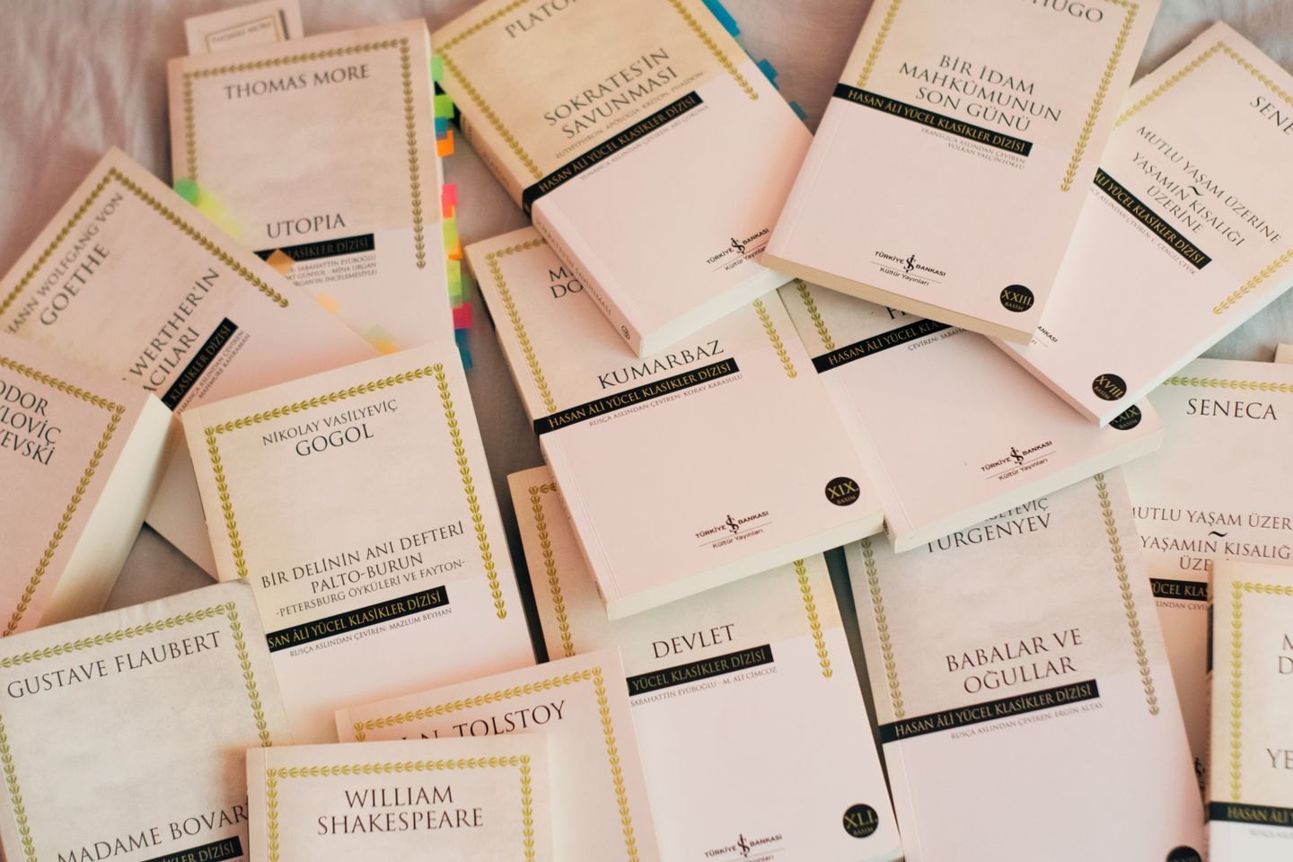
Lay the proposed covers together, including any volumes that already exist. Look for the elements that could carry recognition across the series: the position of the title, a type family, an image treatment, a small series mark or a repeated arrangement of shapes. You do not need to repeat all of them.
Decide which features are rules and which are accidents of the first cover. A title may happen to fit on two lines in volume one. That does not mean every later title will. A useful system anticipates different lengths without making each new book look like an exception patched onto the original.
Write down the relationship in plain language. For example, the author name remains in the same position, each volume uses a different central object, and the series name stays secondary to the individual title. Such a note gives a future designer a decision framework rather than only a picture to imitate.
Colour is one way to differentiate books, but it should not be the only clue. Covers may appear in small images, poor lighting or monochrome contexts. Distinct titles, imagery and volume information help readers recognise the book they want without relying entirely on a colour difference.
Let the distinction come from the actual content. If each volume follows a different place or character, that may suggest a controlled change in imagery. If the books address different parts of a subject, the visual difference can reflect those divisions. Random variation may make the row colourful without helping anybody choose.
Test the most difficult likely case. Use the longest title, an image with an awkward shape or a volume that has an additional subtitle. If the design only works for the shortest title and simplest image, it has not yet been tested as a series system.
Review the fronts together as small images, the spines as a row, and each cover on its own. A series may look coherent when arranged neatly on your screen but become indistinguishable in a search result. Conversely, strong individual covers can lose their relationship when only the spines are visible.
Consider how the system handles a collected edition or a revised volume. Those may need to look related without suggesting they are another ordinary instalment. Establish the distinction before the catalogue grows and readers have to decode it themselves.
Keep editable design files, approved type information and notes about licensed assets with the series record. A later designer should be able to understand the rules and reproduce permitted elements without guessing which files are final or which imagery can be reused.
When an existing series changes direction, decide whether earlier volumes will be updated. A partial redesign can be intentional, but it needs a reason. Compare the cost and the reader-facing result before replacing only the newest cover because it is the one currently receiving attention.
Book design
The back cover has several jobs competing for limited space. Decide what belongs there before the description, barcode and other elements become a squeeze.
Book design
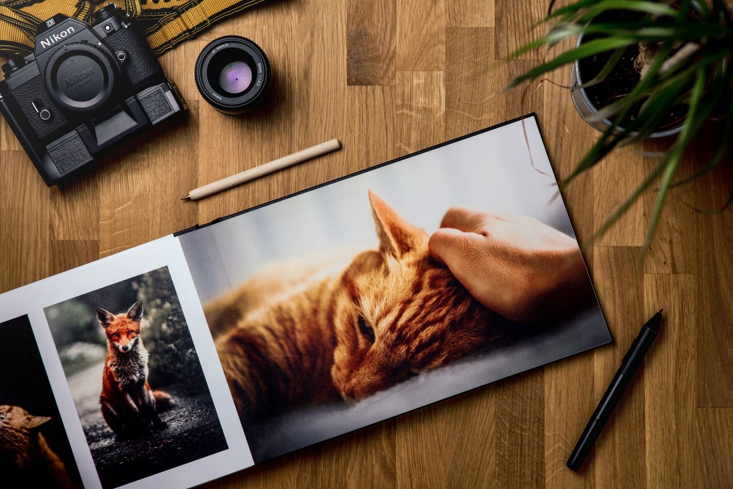
Judge the pixels, the crop and the printed result together before an image reaches the press.