Book design
Image quality at the size a book will print
Judge the pixels, the crop and the printed result together before an image reaches the press.
Book design
Colour differences can disappear in monochrome. Check the information as well as the appearance.
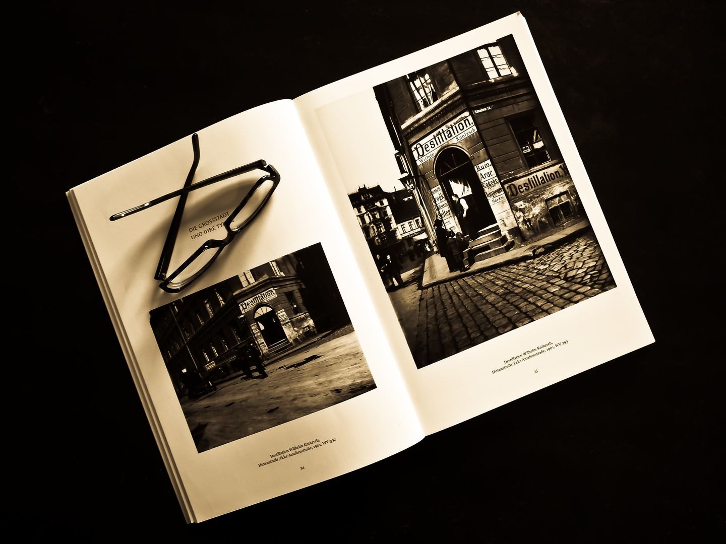
Imagine a photograph of a red cable beside a green cable. In colour the distinction may be obvious; in a monochrome reproduction both can become a similar grey. The picture has not simply become less attractive. It may have stopped explaining which part the reader should use. Begin a black-and-white review by identifying everything that depends on colour to be understood.
Charts, maps, labelled objects and photographs with subtle backgrounds deserve particular attention. A dark blue line and a red line may merge. A pale yellow annotation may almost disappear. A person wearing a green jacket can lose separation from surrounding foliage. Make a list of the distinctions that must survive before adjusting contrast.
Create a monochrome working copy and preserve the original colour file. Different conversion methods can translate colours into different tonal relationships, so inspect the result rather than assuming that removing saturation is enough. Look for separation between the subject and its background, readable shadows and highlights that still hold necessary detail.
Review the image at its final book size. A small screen preview can disguise a face that becomes a grey patch on a printed page. Equally, an enlarged image can persuade you to fix tiny defects that readers will never encounter. Place the image beside its caption and surrounding text to see whether the intended reading sequence remains clear.
For a hypothetical garden diagram, changing red and green boundary lines to different line patterns may communicate more reliably than trying to find two better shades of grey. Add labels where a reader would otherwise have to infer meaning from a tone alone. Ensure that the caption names those labels consistently.
Adjust local contrast only where it helps reveal information. Strong global contrast can rescue a dull overall appearance while erasing texture from bright paper, clouds or pale fabric. If a photograph is meant to show a surface finish, those delicate areas may be its entire purpose. Keep checking the unaltered file to avoid confusing dramatic appearance with accurate representation.
In a set of images, compare tonal treatment across the sequence. An illustration that is nearly black can overwhelm a page of otherwise gentle greys. Try placing comparable subjects at comparable sizes before deciding that they need stronger processing. Layout can create apparent inconsistency even when the images themselves are balanced.
A desktop print is useful for finding lost labels and weak separation. It is less reliable for predicting the production process. Absorbent paper, ink coverage and the chosen printing method affect the result, so use a representative production proof for images on which the book depends.
Mark changes precisely: identify the image, the area that loses information and the desired outcome. “Keep the pale seam visible” tells a production partner more than “make it pop.” Approve the converted version only after checking that the reader can still identify the relevant objects and relationships. A successful monochrome image preserves the job of the original, even when its mood changes.